.png)
As Kintone is in the process of a new look and marketing message, our company certainly had no shortage of history to consider, or elements that we could “rebrand.”
In fact, we had thousands of years worth of history to work with, starting with a Monkey King.
As discussed in a blog post last week, we decided to do a rebrand to take a fresh look at what Kintone is at its core, how the product is perceived by the market and what it does for clients from the clients’ perspective.
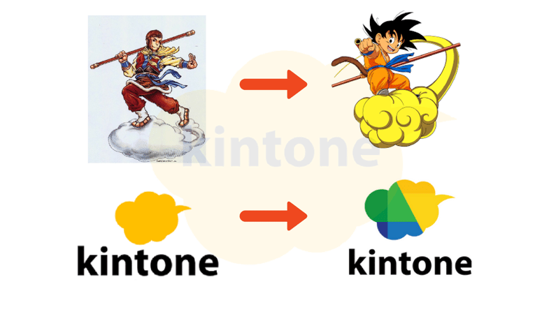
When Kintone, an application platform that provides organizations with a customizable workspace, first launched in Japan in 2011, it started with a gold cloud. This cloud dates back to 1000 A.D. during China’s Song Dynasty. It was later formalized in the 16th century Chinese novel, Journey to the West, with the Monkey King and his somersault cloud that's so fast, it takes him half way around the world in a single somersault.
The more recent popular incarnation was in Dragon Ball Z, the hit Japanese TV show from the late 1980s, where 'Kintone,' which is the Japanese word for ‘somersault cloud,’ comes from directly.
More recently, we in the U.S. made a little modification of the traditional all gold cloud, adding green and blue colors to the gold, to try make it feel a little more modern and to represent the three functional pillars of the Kintone platform designed to make teamwork better: database application, collaboration, and process management.
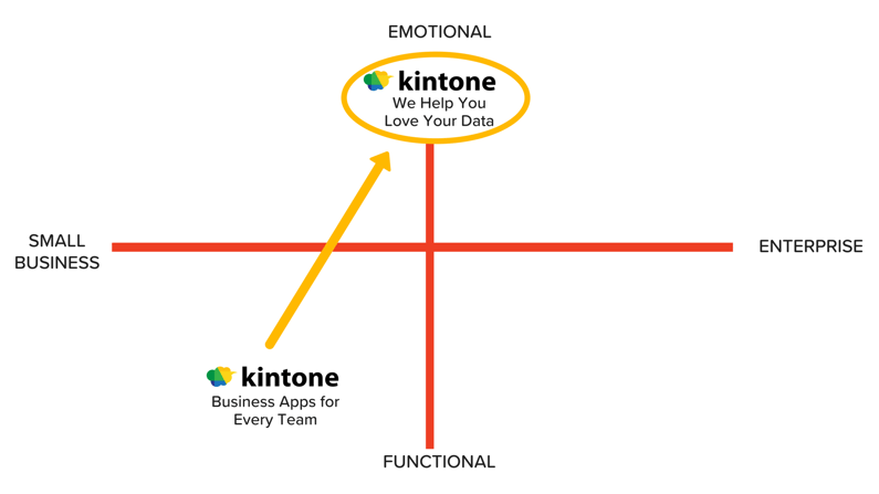
 When we decided to start rebranding in early 2017, we considered if we were just a fast cloud, or if we were something different and much more.
First step, we gathered feedback from our clients and partners.
What we found and heard was varied – kind of a “Kintone is what Kintone does” collection. It makes teams work better, it makes lives better, it provides vision, it empowers, it performs magic, creates instant developers out of regular business people, and it manages entire businesses.
 We had a lot to work with, but a challenging time pinning it down.
What did come through loud and clear tended to be more feeling than function. We were then interested in exploring if there was a space we could find or carve out in this competitive environment that aligned perfectly with what we were starting to see as our core brand characteristics, which also would be differentiated enough to allow us to truly stand out.
 Through a fun process of self-discovery with our branding agency Salt, we did some more internal exploration and analysis to further flesh out our product and company virtues and personality.
And that process teased out some core personality traits which in turn helped lay the foundation for our brand framework and essence. Those traits were: knowledgeable, yet down-to-earth, clever though collaborative, approachable and optimistic.
From these, and a more exhaustive list of functional and emotional attributes of the Kintone platform, we landed on an encompassing brand positioning statement:
“Kintone is a customizable workspace that quickly connects, organizes, and visualizes information and workflows so progressive teams are more synchronized, business is more efficient, and you love your data more than ever before.”
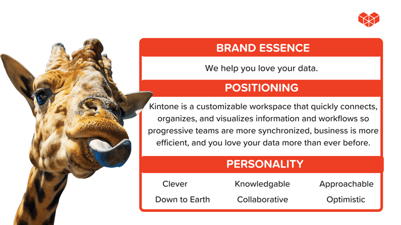
Then, we took the next step to distill it even further into a brand essence.
For the logo, we had a number of options to consider, some closer to the existing one, others way out there, but from the very beginning, there was really only one that felt right: the building blocks heart.
The building blocks component of this logo speaks directly to the creative, iterative building experience of Kintone, while at the same time the heart shape reflects the love it engenders when non-coders and coders alike are able to use Kintone to solve difficult business problems themselves.
From the logo and the brand framework, comes forth the visual treatments that will be extended to reflect the love, the fun, and the diverse world of business and people that Kintone seeks to touch, support, enable and empower.
For me, I just couldn’t imagine a more spot-on representation of our product, our brand, our company, our goals and our vision.
You see, we believe data is all around us and is the core element of our work lives. Rather than having data overwhelm us and repress us, how do we harness it, manage it, process it, visualize it, use it to our advantage, so we can indeed love that data.
We believe Kintone is capable of taking that data and leading a solutions revolution, wherein anyone can harness that data and be a problem-solving hero, anyone in business can be creative, anyone can be a sophisticated application developer, anyone can make their and their teammates work more efficient and more enjoyable, and ultimately make their teamwork, their lives and their work-life balance better.
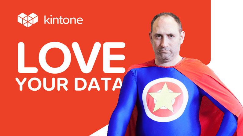 With Kintone, anyone can build to love their data.
That’s what we want to enable everyday as an organization, and that’s what we hope to capture with our new brand identity. Thanks to everyone who has been part of this process -- this includes you, Monkey King.

About the Author
Dave Landa is the former CEO of Kintone and has been on the forefront of the Cloud revolution driving strategic business development on the executive teams of multiple leading Software as a Services (SaaS) application providers dating back to 2004.